Plasticity: UX Case Study
2019
UX research, development, and design
In June 2019 I took a “vacation” to do a week-long intensive UX course. It changed my life, and not just because I have to make SO MANY wireframes these days. It taught me how to rethink problems and how to categorize answers. I can’t tell you how often you can help a client (and yourself) by continuing to define the actual problem. It always helps us find a solution.
Speaking of problems.
The first step was to select a real-world problem that I could address. Through conducting research and iterative testing, my goal was to create an app prototype that effectively solves this problem. Finding a suitable problem was easy enough:
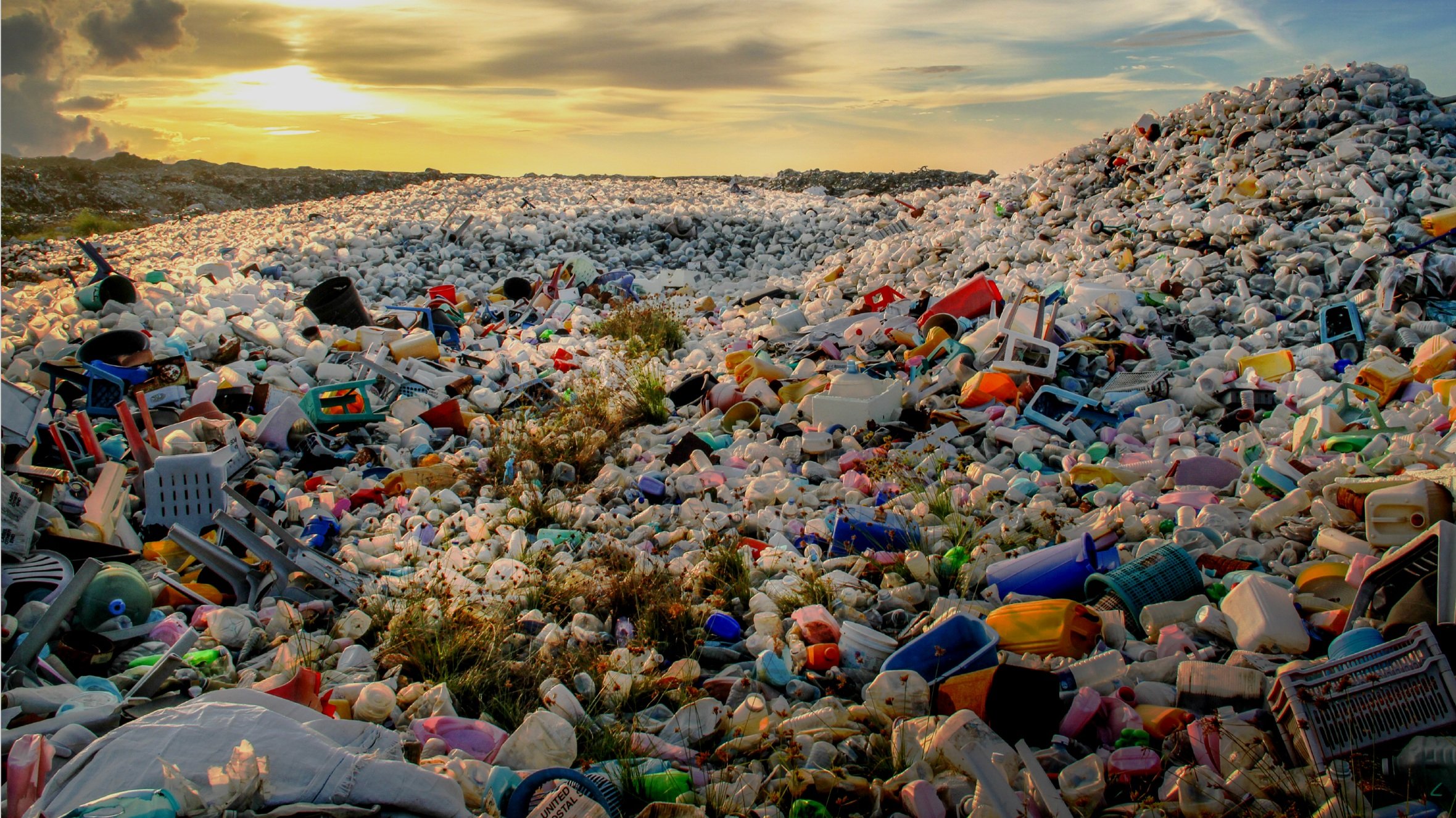
Maybe you’ve noticed, but we use a lot of single-use plastics.
Like, a lot.
I decided to do something about it.
I had no idea how to even approach this problem. I thought I was going to have to go back to my first idea – a dating app that punishes people for ghosting. So I focused on defining the problem, not the solution.
Defining the problem with user research
Based on user interviews, it became clear that people are aware of problem of too many single-use plastics
“I’m conscious when I’m using disposables”
“I think about it every time I make [my daughter’s] lunch”
And they feel really, really bad about it.
“I feel horrible every time I use a ziplock bag”
“It’s on my things-I-worry-about list”
“It causes me severe anxiety, it’s all plastic, plastic, plastic”
They don’t know what to do about it
“Education is the biggest obstacle”
“[buying reusables] was a blind process”
“Nothing is more convenient than disposables”
But they know corporate responsibility is intrinsic to the solution.
“Corporations need to be responsible for their waste stream”
“Food packaging has so much waste”
“Companies are our biggest proponents when it comes to change”
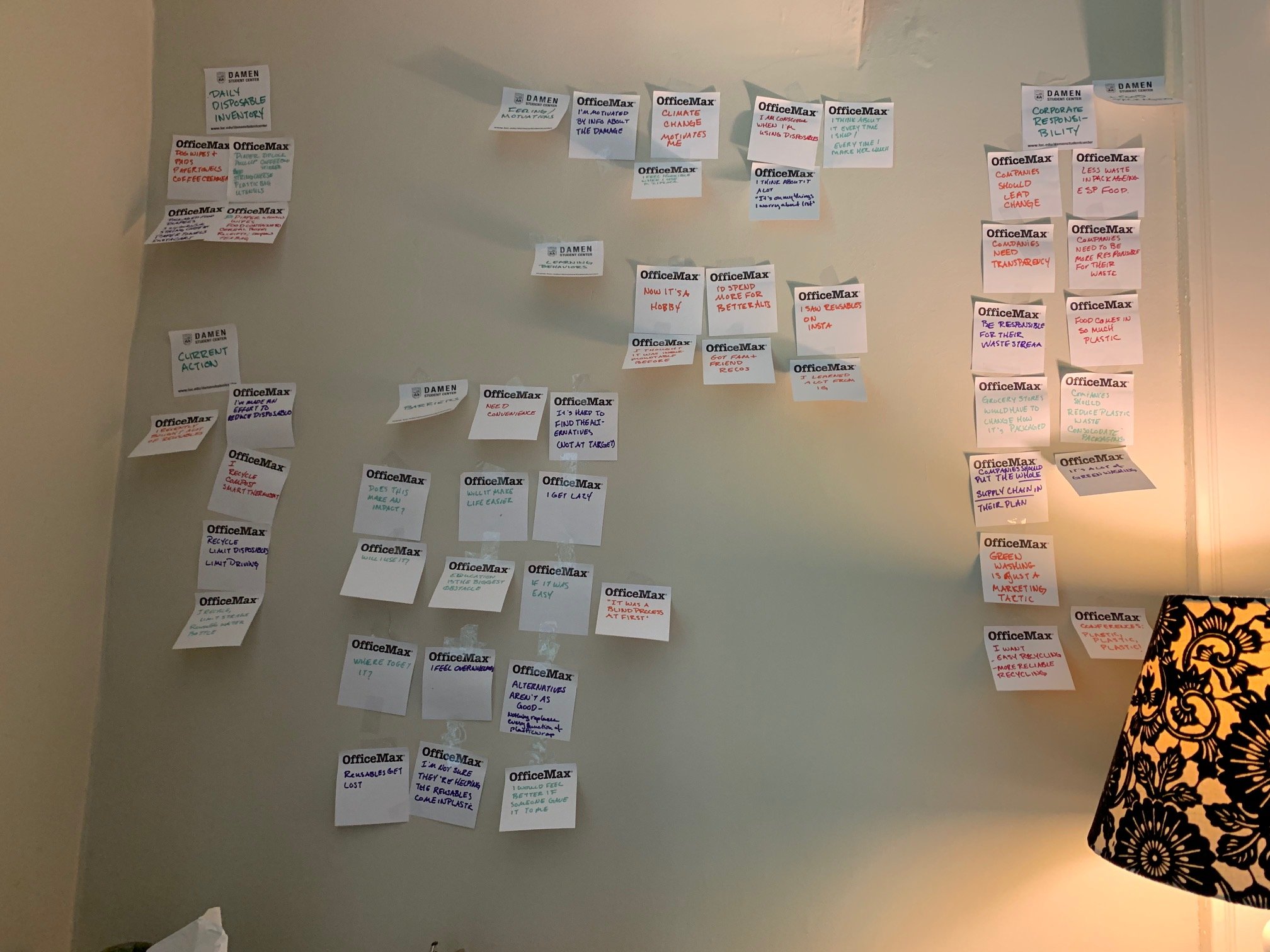
Affinity mapping (with free sticky notes because I’m thrifty).
After initial interviews on this subject, I gathered and categorized my findings:
Then I did some comparative research to find out what was out there already. There wasn’t much.
Left to right: Buycott, a barcode scanning app that helps you align purchases to your chosen cause campaigns; My Little Plastic Footprint, where users take pledges to reduce plastic use; Joulebug, an ironically labor-intensively game intended to help you save energy; Habitica, where users set their own habit goals and are rewarded by a game for good habits.
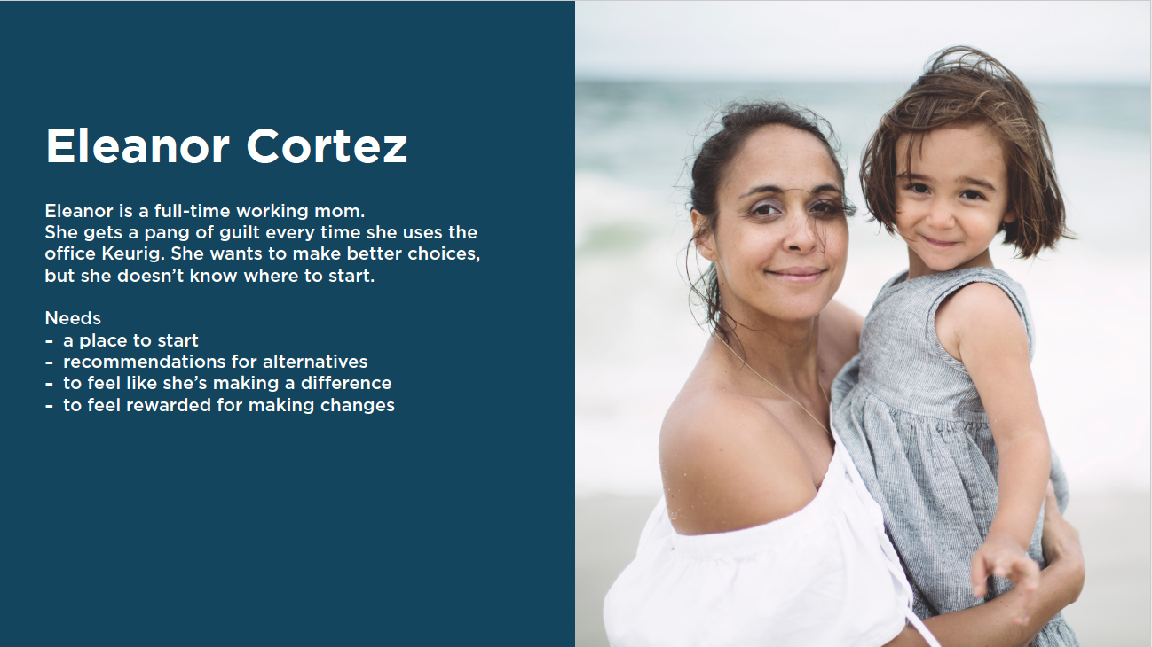
Not much is out there now. But our user is ready for change. Speaking of our user, meet Eleanor.
The design process
It all started
with Eleanor’s
emotional journey
Taking the train to work with her iced coffee in hand, Eleanor sees that video of the sea turtle with straw stuck up its nose.
Epiphany, life change through the plasticity app, and ultimate satisfaction with her choices follow.
To design the app, I started with a user flow, card sorting by users, a site map, and a paper prototype.
My biggest takeaway from the first round of testing: Condense categories as much as possible.
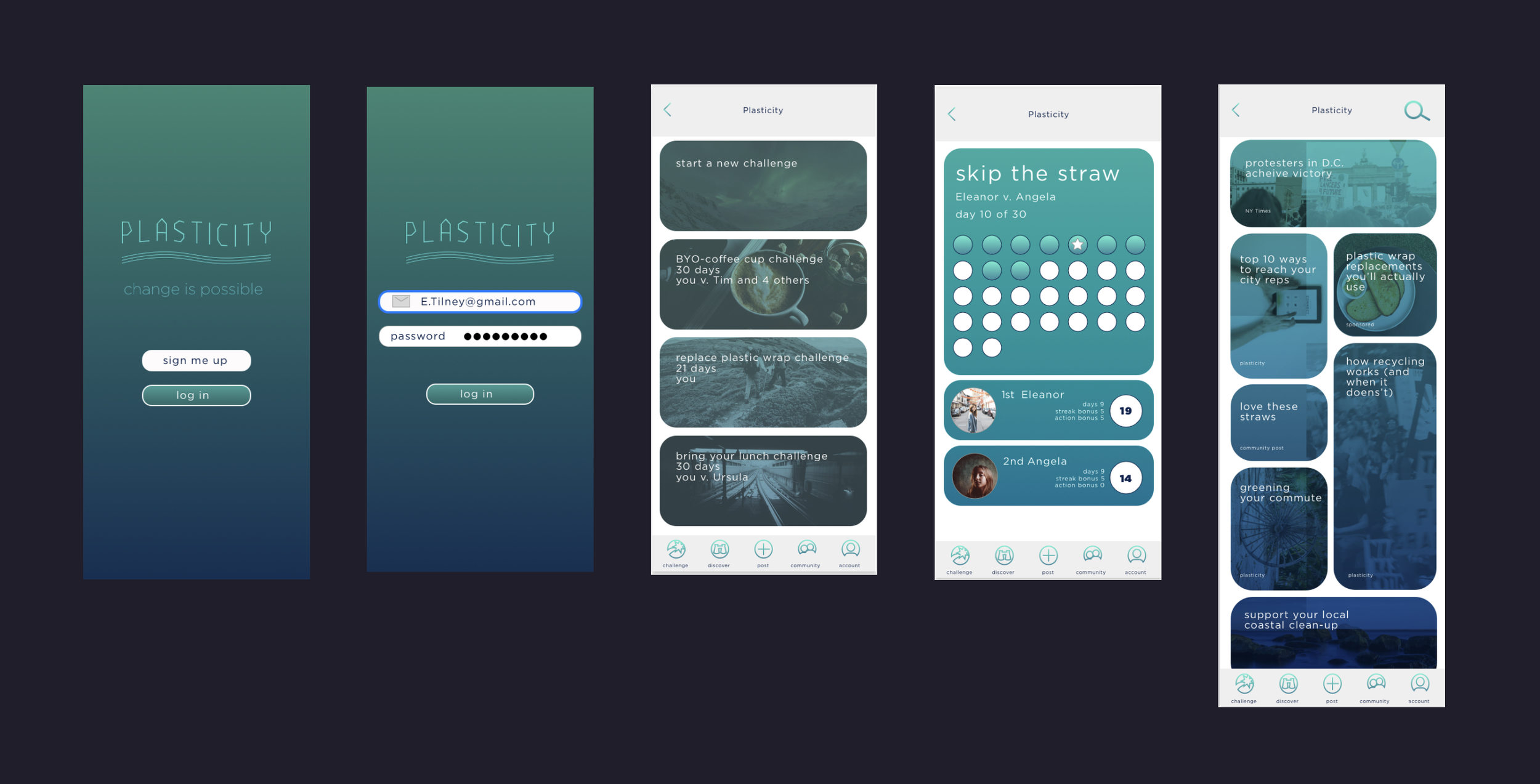
Then I proceeded to wire frames and prototype testing:
App design


