Palermo's Pizza
2015
Art direction, print design
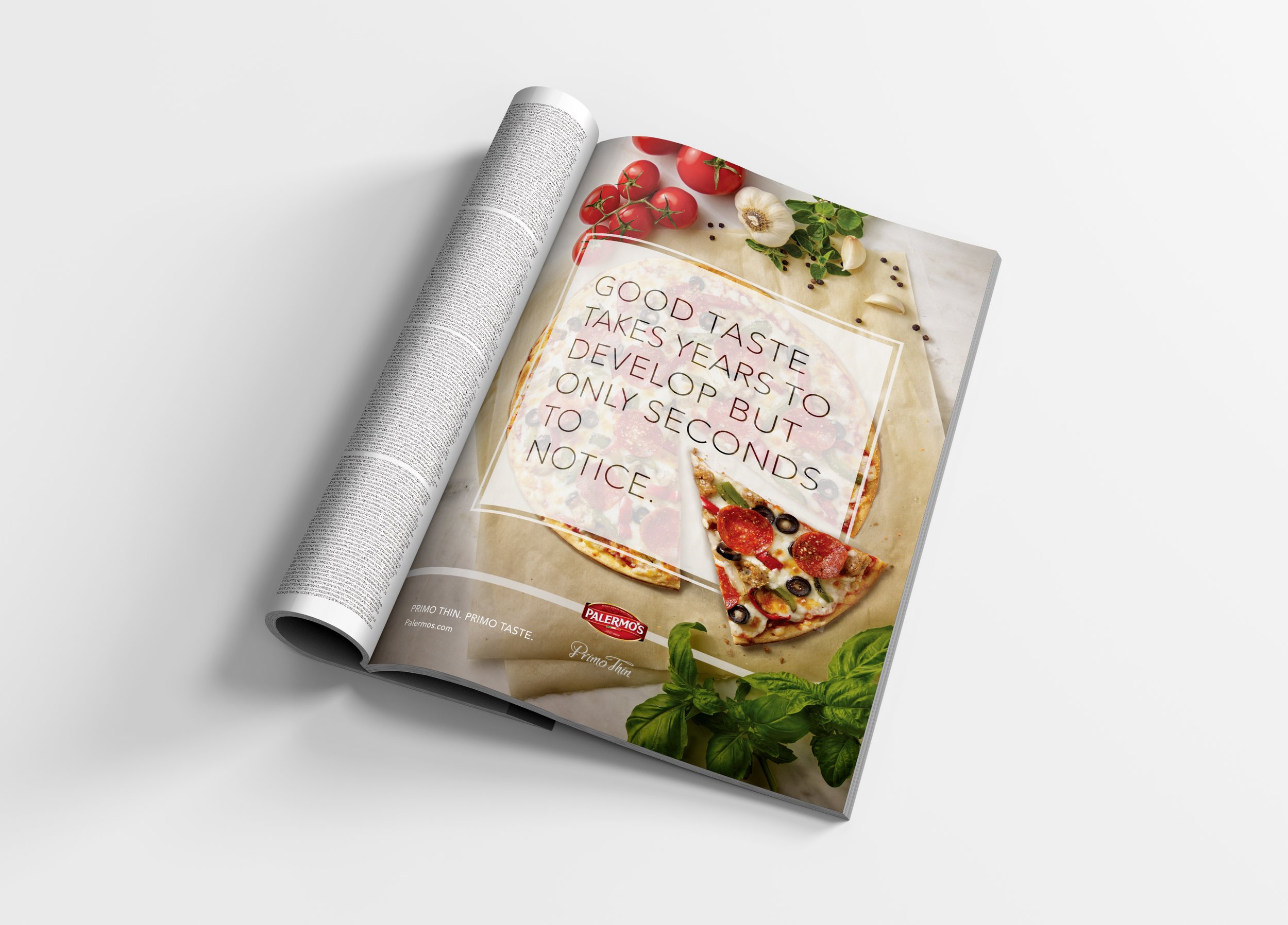
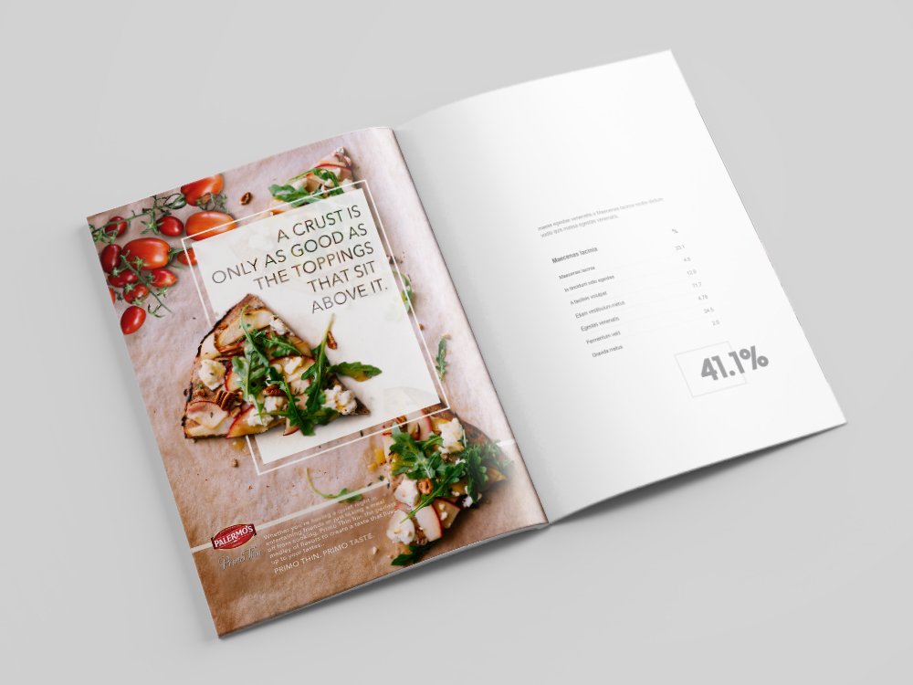
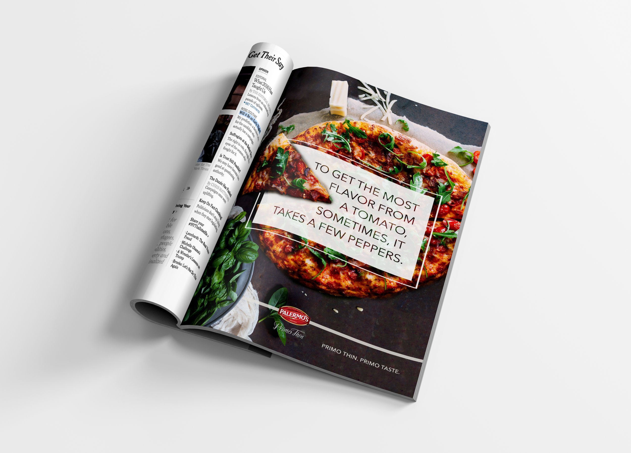
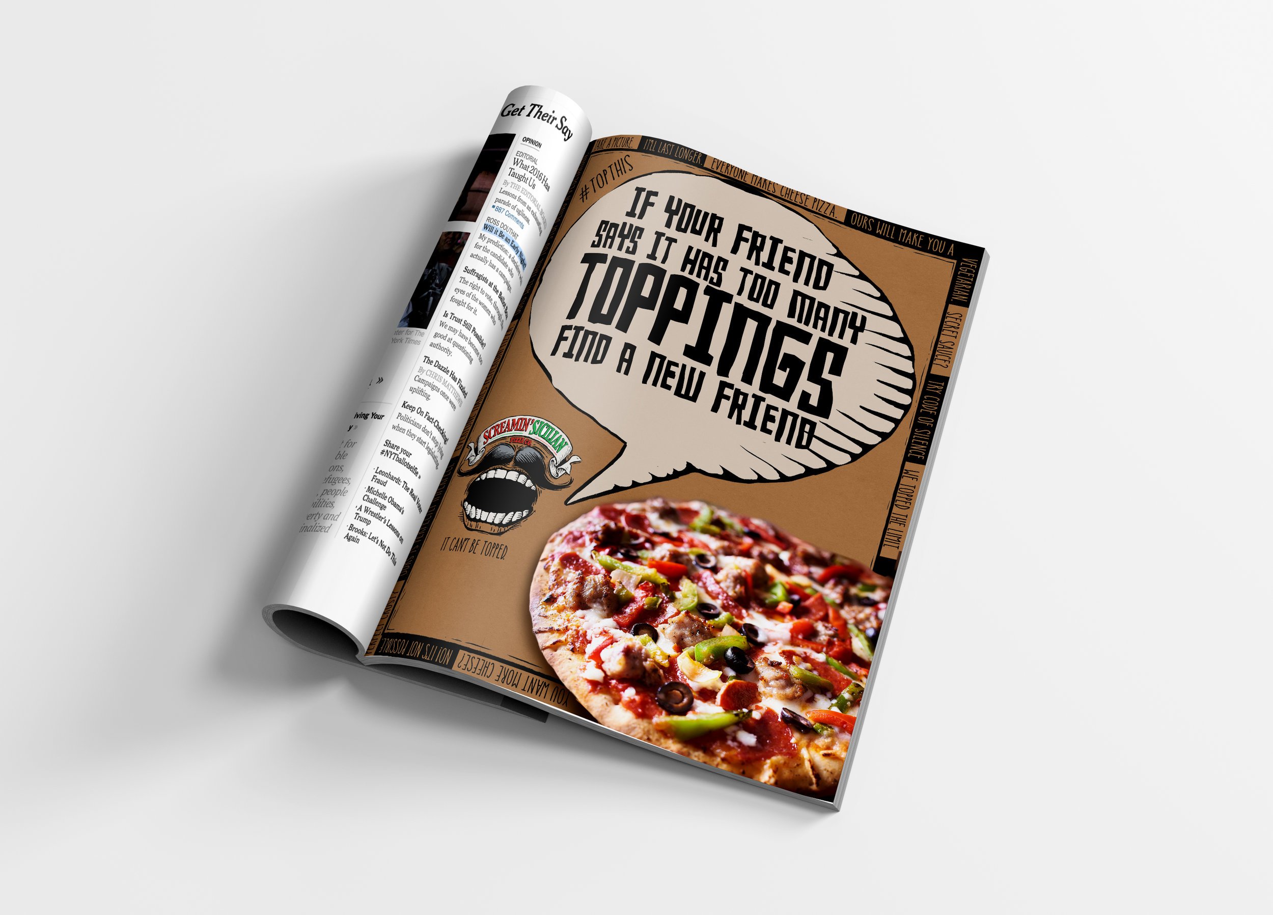
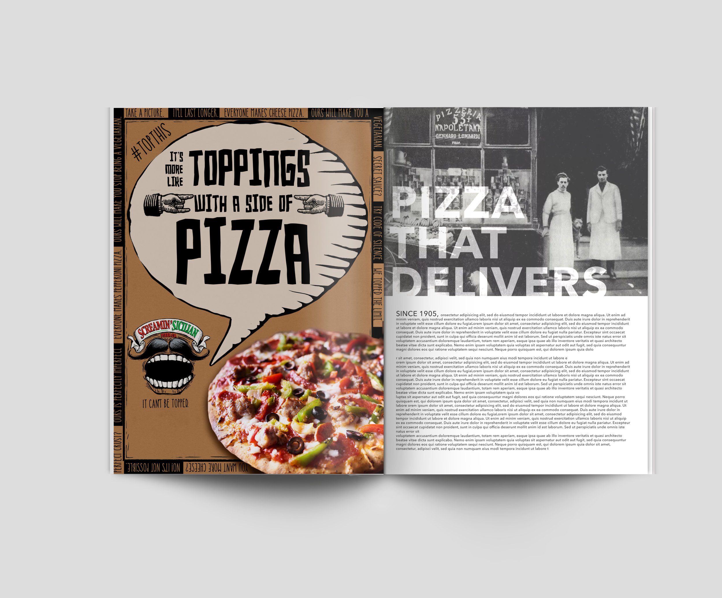
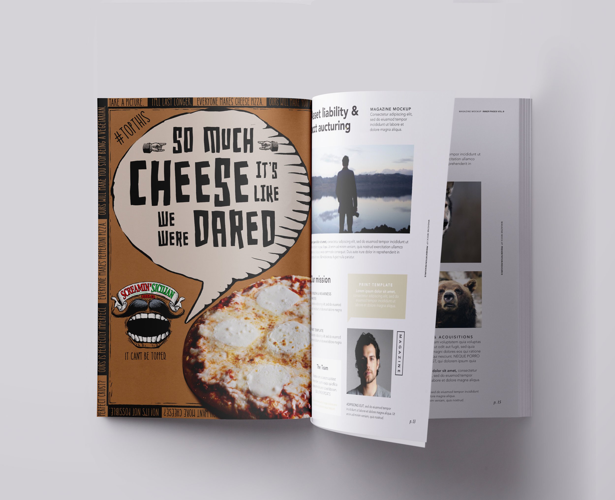
I worked with two Palermo’s brands with very different personalities; Primo Thin and Screamin’ Sicilian. Primo Thin is lighter, ingredients-focused brand with clean design and beautiful food photography. Screamin’ Sicilian is a loud, toppings-loaded brand with a look and an attitude to match.
