
Designs for
HP Business Rewards
2020-2022
Art direction, illustration, strategy, UX
Four different brand guidelines came out during my time on this account.
Consider this a testament to my ability to create a breadth of work, from illustrations to UX, and to make hairpin turns alongside my (awesome) client and creative team.
Set your time circuits. We’re traveling backwards through time, beginning with my last project for HP Business Rewards: redoing the whole dang website.
The previous functionality remained, but we redesigned every page in the newest, shiniest, rainbowiest, and longest brand guidelines ever. To keep it clean and cohesive, we took their new palette of rainbow ombre and applied colors in functional ways, i.e. purples/pink/orange for promotional content, teal/green/lime for recycling and HP Planet Partners, blue for account functionality.


Before the hugely expanded color palette and full rebrand came about, a less expanded color palette, with new iconography but limited other brand changes premiered. It only was only around for six months, but we made the most of it.
HP Business Rewards introductory video
2022 Q4 Security Promo



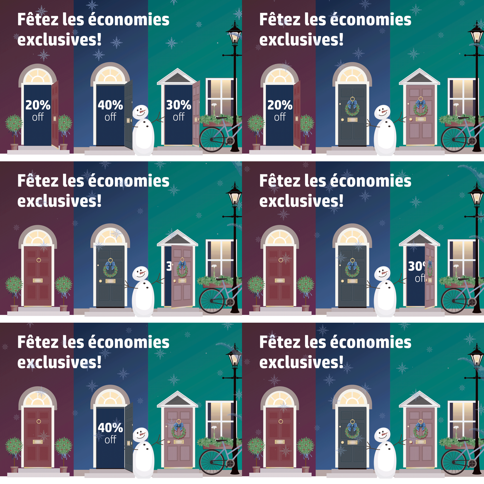
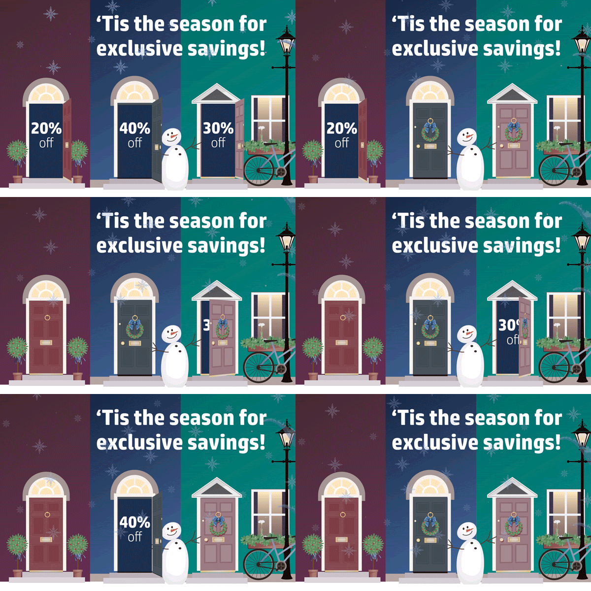
2022 Holiday Promo
The sustainability work had its own brand guidelines in 2021 and 2022, so I guess it was actually five brand guidelines in my time on this account. Planet Partners was related to, but not actually part of, that work. So I interpreted their color palette to make these animated cut paper style illustrations. This campaign for the Planet Rewards promotion for these two years was unique to Business Rewards, and they were an absolute delight to work on.

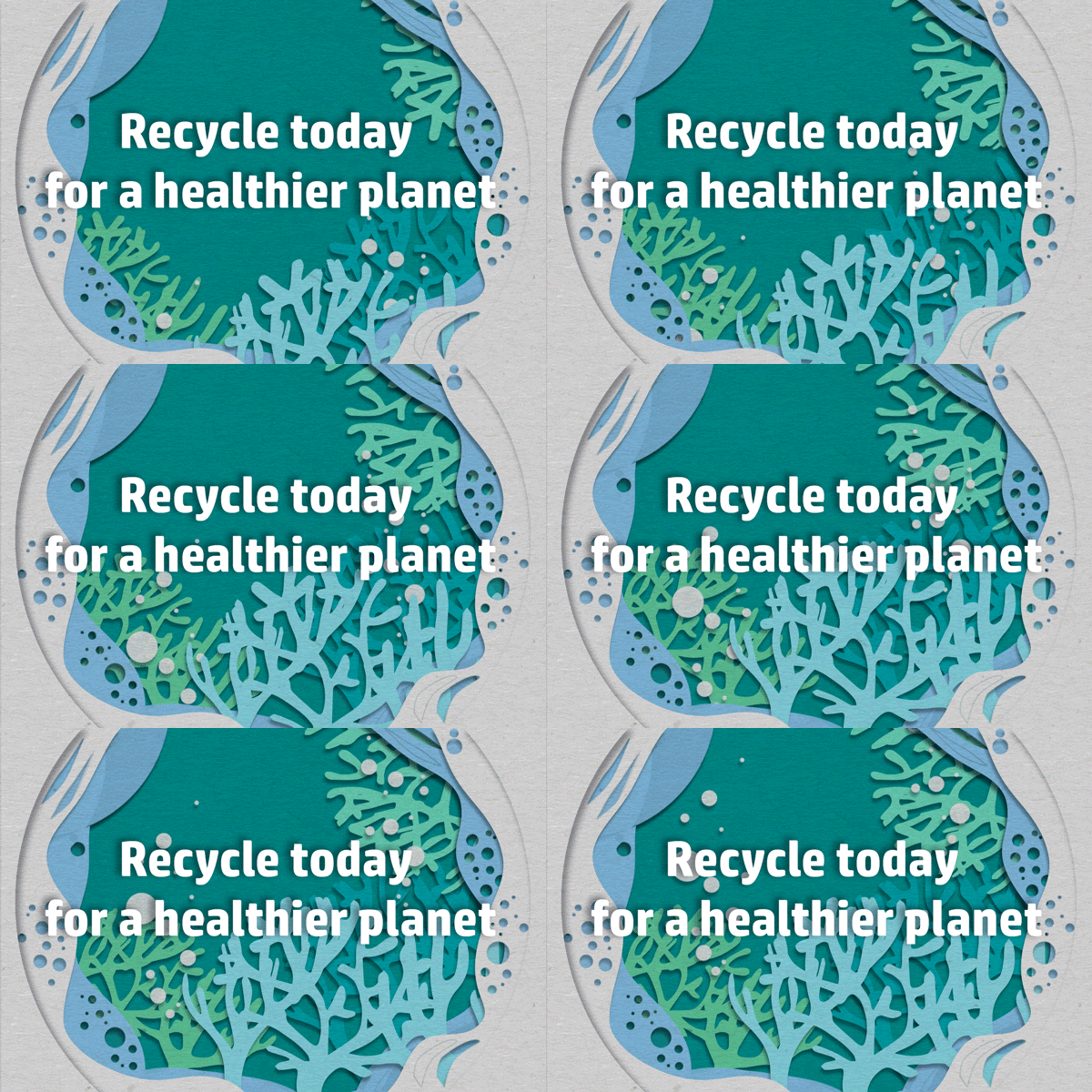
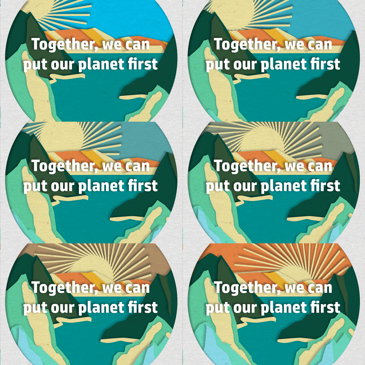
Illustrations for the Planet Rewards campaign for HP Business Rewards
Before this, we had the most simple and corporate version of the brand, we couldn’t do much from the agency side to change the brand, but the popularity of the 20-year-old program had waned. So we proposed and sold in a renaming and refresh, centered around a new name with it’s own logo. It made the purpose of the program clearer to new members, and revived interest and awareness in lapsed members.
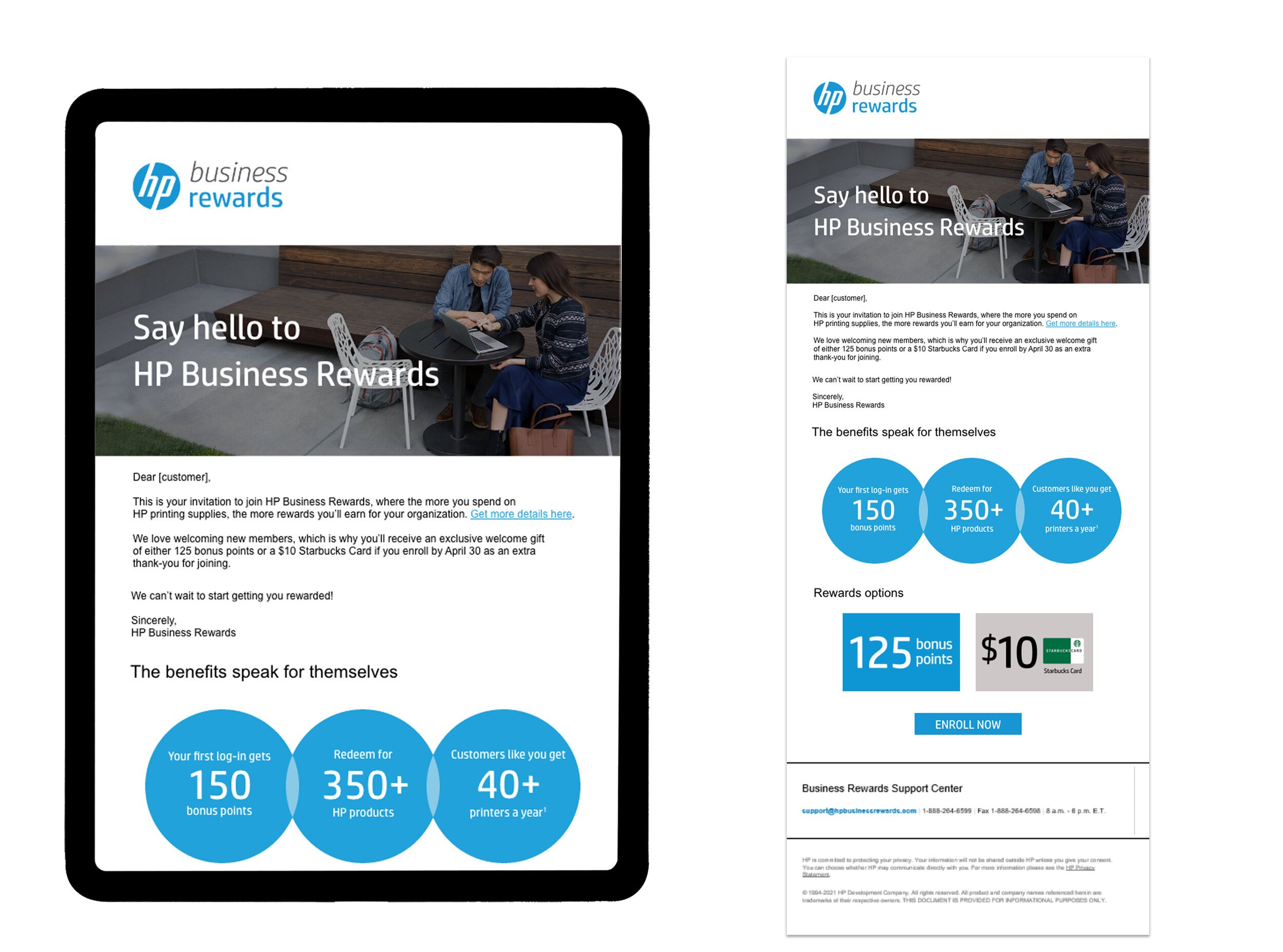
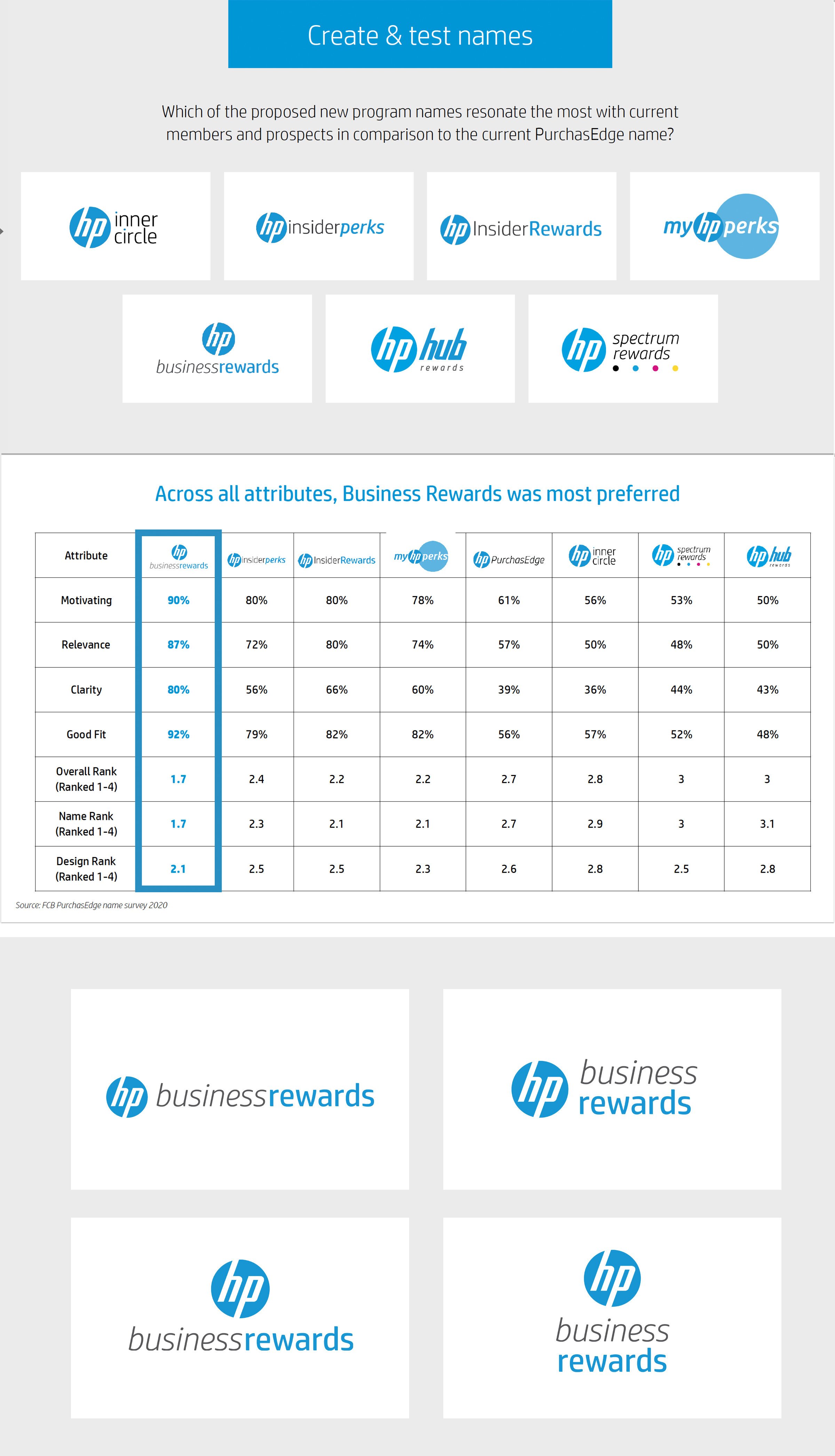
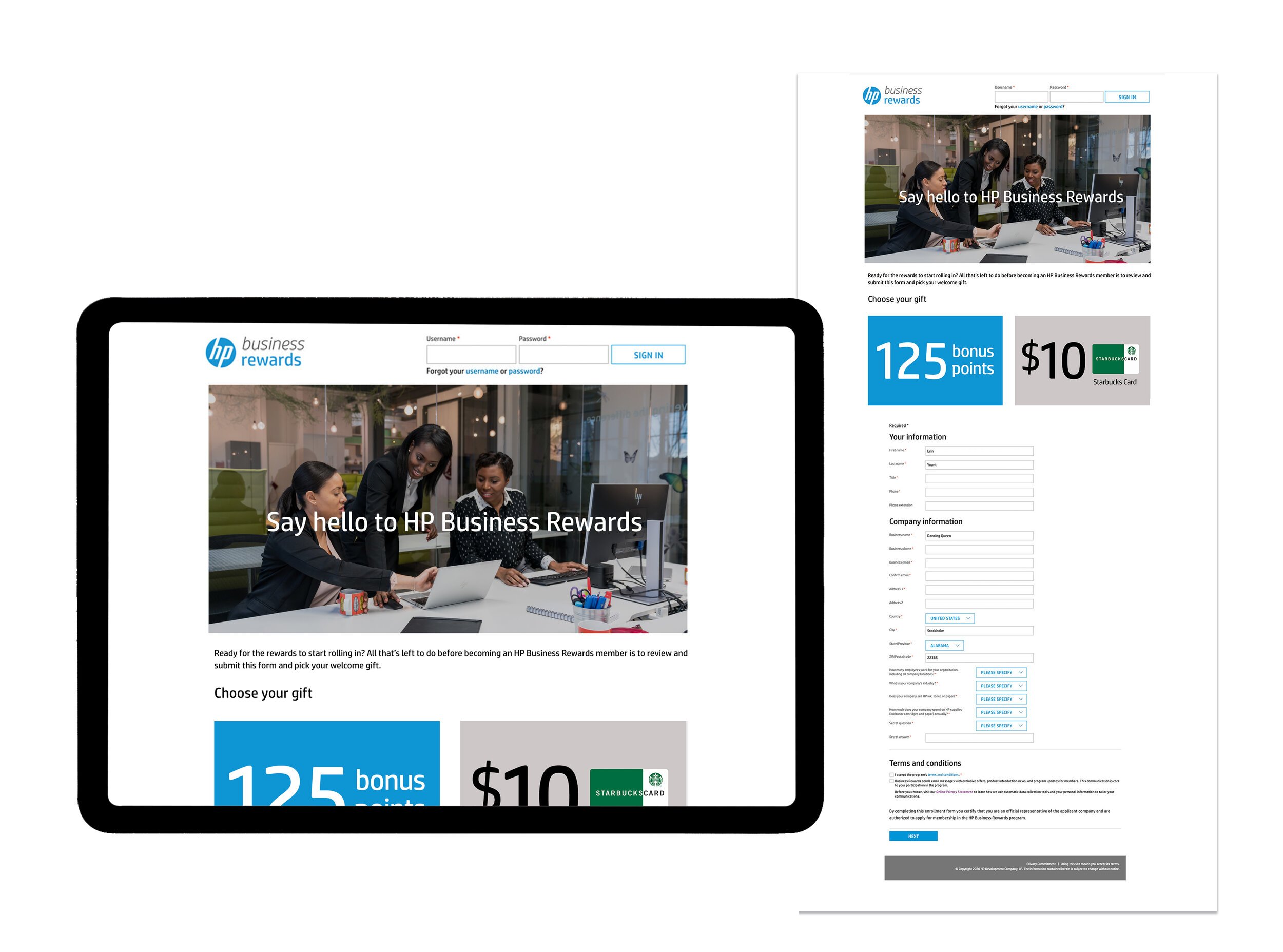
It’s spring 2020. I’m new on the HP account, and working from my coffee table.
At the time, this program, then called PurchasEdge, started off with the most simple and corporate brand guidelines. But working closely with our client on specialty programs allowed us to lift the creativity of the work above the limited options on their asset hub.


